First was Juventus, with the double “J” in place of the historic oval crest. Then it was Inter’s turn, which abandoned the letters “F” and “C” to make room for only the “I” and “M”. An aesthetic revolution to present itself to the world in a more modern and iconic way through the official logo, which in recent days also affected Latina Calcio, which said goodbye to the municipal tower and the date of birth of the city to exalt the face of the Winged Lion of San Marco.
The target? «Maintain the identity by creating perspective and exporting the brand abroad» explained yesterday Daniele Botti, CEO of Modì, the communications agency that created it. «The lines of the new brand are inspired by the architectural methods of the city, in a rationalist style – explained Botti, who was keen to clarify the similarity with that of Venezia: «The club has effectively abandoned it, leaving us the possibility of “to take possession of it” making it consistent with design needs, giving Latina its authentic Winged Lion. We kept the iconic black and blue stripes, playing with the gold tone to give it the majesty it deserves.”
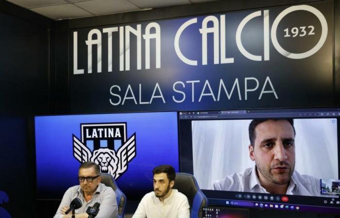
A choice that not everyone among Latina’s supporters appreciated. This explains the, let’s say, “reparative” press conference, but also the protest that took place outside the stadium gates.
«This is a broader project to give Latina greater visibility at an international level – the general director Biagio Corrente tried to relaunch -. A rebranding that gives a breath of fresh air: a modern society cannot fail to also take into consideration the world of millennials.” It is impossible to pretend nothing has happened and ignore the fact that the new logo has not warmed the hearts of the fans who even yesterday did not fail to express their disappointment, especially with the communication methods.
“There was no bad faith in not wanting to involve them – the company’s response -. We can understand the bitterness and sense of disorientation, but it was done for the good of the club and its positioning on the international stage, with the utmost respect for the city and what has been done to date. Even President Marani called us: this is the only way to innovate, going beyond 90 minutes on the pitch. We believe that this path can lead us to results: time will tell if we were wrong or not”. “The narration of the process was made in the days before the launch – marketing manager Francesco Terracciano wanted to clarify -. Just think of the officialization of the collaboration with Modì and EZ, who have this type of operation among their distinctive features. Transparency towards our fans was maximum: we wanted to give the square something that was an identity. Then we enter the aesthetic judgment, where no one is really right and, above all, it takes time to internalize the novelty. We are trying to elevate ourselves to a point of reference for the entire province, telling a story even outside the nation through the language of football”. “There is no international reaction that can make up for the disappointment of the fans – added Botti -. On the other hand, when it comes to brands, time is a gentleman. I think of Gratton’s little wolf from Roma who today, after a long time, has come back into fashion. In the brand system, an old logo never disappears, but becomes part of history”.
Fabrizio Scarfò
© ALL RIGHTS RESERVED
© ALL RIGHTS RESERVED
Read the full article at
The messenger


