


An installation by the Municipality will be positioned in Piazza Municipio with the giant writing “Napoli”. This is the new brand of the city.
Renderings by Brand Napoli
Here comes the “brand Naples” in Piazza Municipio. A mega permanent installation 12 meters long and 2 meters high, with the writing “Naples” in large letters (each letter will be 1.7 meters high), the caption in English “A NEW CITY”which recalls the ancient Greek meaning of the name, Nea Polis, i.e. the new city. All mounted on a bench, where you can sit. The work, as anticipated by Fanpage.it, was designed following a tender from the Municipality of Naples, with funding from Ministry of Tourism. The installation project is byarchitect Marco Tatafiorethe realization of the work of Interspot Advertising.
On the back of the panels there will be some symbolic images of the city of Partenope. Among those chosen in the widespread renderings, lto pizza, the red horn (traditional lucky charm), the babà, Vesuvius, the Toledo station of the Line 1 metro, but also kayaking on the Gulf. “In the long term it could become an identifying symbol of the City of Naples – writes the Municipality in the approval resolution – contributing to the notoriety of the city at a national and international level”.
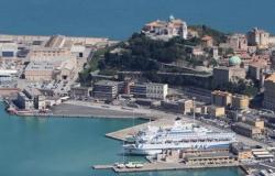
It will be placed in the final part of Piazza Municipio, at the crossroads between via Acton and via Cristoforo Colombo, right in front of the Maritime Station and the cruise ship landings. On the opposite side of the square from the Maschio Angioino and slightly rotated towards the sea, therefore not parallel to the road. The brand’s work was also insured all risk against possible vandalization.
Elodie in concert at the Maradona Stadium in Naples on 12 June 2025
The project of the Municipality of Naples
“Naples is, to date, one of the destinations most affected by tourist flows – we read in council resolution 223 of 29 May, proposed by the Tourism Department – This goal was also achieved thanks to the planning and organization of initiatives aimed at increasing tourist flows and to monitor their progress with the aim of promoting the Naples destination”.
The project was financed with funds from Ministry of Tourism, 1.2 million eurosintended for the Grandi Destinazioni Italiane network for sustainable tourism, which includes 5 cities and more Naples, also Rome, Milan, Florence and Venice. The Neapolitan capital joined on 8 November 2022 and presented the project Naples Tourist Tech 2022.
The ministry has also developed a special logo Great Destinations for Sustainable Tourism, consisting of 2 partially overlapping green and red circles, which will be used for all communications related to the project. Both this logo and that of the Municipality will be present on the installation.
At the end of 2022, as anticipated by Fanpage.it, the Municipality has decided to equip itself with a brand and a brand image plan that contains the word Naples. A public tender for 230 thousand euros was made for the communication campaign aimed at the development and promotion of both the “Naples” brand and the twinning activities to be implemented with other Italian municipalities. Another tender for 230 thousand euros was allocated to the creation of a Tourist observatoryaimed at “monitoring and processing data on national and international tourist flows in the City of Naples and the development of new marketing strategies to implement the tourist offer”.
The requirements of the Superintendence
Among the initial hypotheses it was thought to position the Napoli brand in front of the Neptune fountain in Piazza Municipio. The Superintendency of Cultural Heritage, however, gave some instructions on 8 April. Here they are below:
The artefact must be installed in the part of Piazza Municipio overlooking Via Acton, in a position opposite to Castel Nuovo and slightly rotated from the sea front.
The dimensions of the product and in particular of the bench base, will have to be re-proportioned by reducing the existing spaces between the shaped sheet metal letters, the colored transparent panels and the mirror panels.
The structures cannot be anchored to the ground, but must be ballasted to the ground, to avoid damage to the flooring.
On April 29, the company in charge of the technical design declared that it had fulfilled the Superintendency’s requirements and sent the Certificate of Regular Execution of the product and the testing certificate.
How the Naples brand is made
But what will the installation with the Naples brand be like? The base will be a sort of bench, 12 meters long, approximately 2 meters wide and 2.20 meters high. Three parallel rows of panels will be recessed above it. In the first there will be the word “NAPOLI”, written with black shaped sheet metal letters. Each 1.7 meters high. The second row (the central one) will be made up of panels with colored transparent backgrounds, each corresponding to a letter: the colors are white (“N” and “L”), blue (“A”), orange (“P”) , green (“O”) and yellow (“I”). The third row will consist of mirrored panels.
The symbols of Naples: Vesuvius, horns, pizza and babà
On the back of the third row there are images with the symbols of Naples. Among those chosen, include pizza, horn, babà, Vesuvius, the Toledo station of the Line 1 metro, and kayaking on the Gulf. The proposal in question is inspired by Naples. The project is inspired, we read in the document, “by the forms of its nature and its symbols linked to the world of culture, art and gastronomy”.
“The shape of each letter refers to characteristic iconic elements, such as 6 windows overlooking the most loved points of the city. The color palette wants to tell a contemporary, young and sustainable Naples. Saturated colors for greater appeal in digital applications. This proposal has an enthusiastic and self-confident tone of voice, which outlines a charismatic, captivating identity full of different nuances. For this reason it identifies perfectly with the city of Naples”.
Renderings by Brand Napoli
The slogan: “Naples – A New City”
For the caption, writing in English – the international language – was chosen. NAPLES – IN NEW CITY. Here’s the reason:
Of the many traditions that characterize Naples, the one that stands out above all is its ability to be reborn every time as new. Over the years the city has in fact been able to absorb all the
external influences, integrating them into language, architecture, art, and then reinventing them in a
unique and unrepeatable mix.
An attitude that continues today, evolving to adapt to the new challenges of every day.
The etymology of the name “Naples” – from the Greek Neapolis – is still very current, and today takes on an even stronger connotation: new city means city of the future.
Renderings by Brand Napoli

