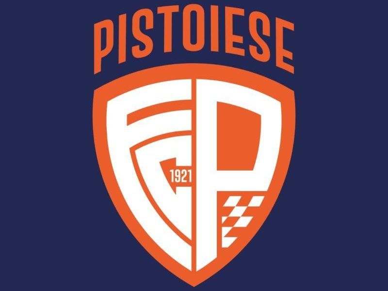
Pistoiese “gets a makeover”: here is the new logo that combines the past, present and future of the orange club
New beginning. New society. New logo. The Pistoia branded Sergio Iorio starts first of all from its own image, not only thanks to the important faces in the management organization, but also through a new emblem that best represents the spirit of the Dutchwoman. In the setting of the Nursery Campus in Via Bonellina, in fact, the new “face” of the club was presented, with a logo – created by the communications agency Wema & Supernova – designed specifically to combine past, present and future.
|
|
The logo was shown to fans and the press Alex Marracciniproject manager of Wema & Supernova: «This work was carried out following the requests of the company, acting together with the people who decided to relaunch the club. The aim was to create a logo that looked to the future remaining however in continuity with the Pistoiese tradition. The values of the coat of arms, in fact, are those of the courage and the sense of belongingas can also be seen on the shield. The “naming” is the most modern partwith the letters FCP that refer to the name of the team. Since it is football, we also included a orange chessboardin addition to the reference to theFoundation year. The logo is part of a broader marketing strategy – Marraccini underlines -, being adaptable to paper and digital use. Finally, on behalf of Wema & Supernova, I can say that before being a communication agency we are a local company, and therefore we are obviously linked to Pistoiese: working together with the club to create the new logo, therefore, was a great pride».


